BLOOM: ALL FLAGS FLYING
October 31, 2015
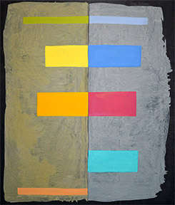
Randy Bloom, "Why? Why? Why?" 2015. Acrylic on canvas, 79 x 67 inches. Photo Courtesy the Artist.
In her exhibition titles, Randy Bloom uses language as contemporary as today’s news. Her exhibition at André Zarre is “Don’t Shoot: All Lives Matter” (through November 14). But her work combines a technique that goes back to Cro-Magnon times with imagery that continually evolves—it’s never been the same for long, nor is the end in sight.
One constant through all of Bloom’s many phases is a firm, bold, decisive and classically simple manner of paint application – no artistic wobbling or daubing.
The other, even more admirable constant is color that is clear, pure, beautiful -- and off the beaten path. Her palette is at once so vivid and so mellow that it can upset viewers accustomed to the fashionably murky or the seven standard hues of the rainbow.
Her work is serious, but at the same time, jolly. In art as in life, Bloom loves a good time. Born a striking brunette, she not long ago went platinum—said she wanted to know if it was true that blondes had more fun. She now says that, yes, they do.
When I first became acquainted with her, she was spending a good deal of time attending integrated workshops in South Africa. Later, she had a show in Japan. Most recently, her favorite international home (away from her loft in SoHo) is Istanbul.
Now to the paintings in “Don’t Shoot: All Lives Matter.” Yes, their technique is painting—though with wrinkles you won’t find in the caves of Altamira. For her bigger paintings, Bloom uses acrylics, not watercolor or oil, and puts it onto canvas, not walls.
Much work takes place while the canvas lies on the floor, and the new paintings look like the first, and maybe also the second of their three layers are stained in or rolled onto the canvas—they are so soft and fluid-looking.
However, the third, top layer is much firmer and looks like it’s been applied with brushes. Sheesh! Aren’t brushes supposed to be the property of old-fangled, representational painters?
Well, yes – and no. Any technique is right, if you can make it work for you– and Bloom’s creation of brush-like imagery sure works for her.
As I said earlier, the images themselves – Bloom’s idiom – have constantly evolved since she first achieved a mature style in the 1980s – not that long after she graduated in 1976 from progressive Franconia College in New Hampshire.
At her website, you can see some – though not all—of the many veins of imagery she’s explored over the years, from “circles” and “diamonds,” mostly in the 1980s and 1990s, on through “boxes” in the early 21st century and “dots” and “grids” in the past few years.
The latest work hasn’t yet been put in a category. All it says at the website is “new.”
You have to go to André Zarre to really see what it’s all about (and there, you can also see the other “solo” show at the gallery, paintings by Dee Solin. It’s a fine show, too, but as I wrote about Solin at length last spring, I’m focusing on Bloom, this time around).
Walking into the entry gallery at Zarre is like walking into a pirate’s treasure cave. You are surrounded by seven big, spot-lit paintings. They glow like jewels because each has a base layer of charcoal gray paint that also surrounds its image—setting that image off like the black velvet of a jewelry case.
On top of this dark gray layer in each case is a slightly smaller, very fluid rectangle of a paler color, usually but not always grey and split up the middle by a very narrow, very straight dark line.
And on top of these pale layers are stationed bright, mostly horizontal but sometimes vertical rectangles that stick out to the right and/or left of that central vertical spike.
To Carter Ratcliff, the critic who contributed a statement for the show, the black lines up the centers of these canvases suggest a human spine, with the horizontal bars of color perhaps analogous to limbs, and the missing head “virtual, a realm of thought and feeling we share with the artist…”
He is also reminded of a “bird’s eye view,” so we see from above “a flat stretch of terrain,” with the bars of colors equal to “plots of land.”
I too see hints of a human figure in the vertical central strip and horizontal rectangles, but I also see tall, proud pine trees with clumps of branches intersecting with the trunks.
Also (here is a truly archaic association): how about those outstanding bars corresponding to the stiff bright flags used as semaphores – not “semaphores” as the word is used in computer science, but in the earlier sense of devices to signal messages at sea (and sometimes still employed there, when more modern equipment goes down).
Most of all I am reminded by Bloom’s horizontal bars of flags flapping happily and vigorously in a high old wind, bringing life to all that surrounds them.
Some people still think that abstract art has no relation to the visible world, but as I have been saying for a while, artists can’t paint what they haven’t seen in the world around them.
Abstract art allows them to take the lines and curves of that external world and –without realizing it -- simplify and synthesize them into images that work in their own right, but also allude to their many sources – as Bloom’s paintings so magnificently do. Be the first to comment